Companies want to offer better service for their customers and improve their business growth and achieve their respective targets or goals. By analyzing the sales data of the company, one can see how the company is performing. Has the performance improved or declined? Where is the company losing its sales? Many other questions can be answered with the sales analysis.
In many companies, the sales team gets timely updates (daily/weekly/monthly) updates of the sales the company makes in the form of traditional excel sheets. Though analysis can be done using Excel, it has many shortcomings. The BI tools such as Power BI, Tableau offer many advantages which can be seen in this project.
To discover the hidden data insights so as to make better decisions for improving the sales and reduce the time spent on gathering the data for summaries.
This analysis can be used by/for any company which wants to see the overview of the company’s performance and take the business decisions.
Once automated, the sales team’s time can be saved from data gathering and analysis.
Once the dashboard is created and the workflow is automated. The Sales Analyst’s time on obtaining the data manually in the form of excel sheets and doing the data gathering, cleaning and then doing analysis can be reduced a lot.
Can get updated information and can take better sales insights.
With just a couple of clicks, up to date information can be extracted and analyzed. This helps the stakeholders to make better business decisions.
The highly interactive dashboards allow users to drill down into the data and explore different views and perspectives which makes it easier to identify trends, patterns, and insights that might be missed in static Excel spreadsheets.
Interactive dashboards: Dashboards are highly interactive, allowing users to drill down into the data and explore different views and perspectives. This makes it easier to identify trends, patterns, and insights that might be missed in static Excel spreadsheets.
Real-time data updates: Tableau dashboards can be configured to update automatically as new data is added, ensuring that users always have access to the most up-to-date information.
Scalability: Tableau is designed to handle large datasets and can scale to support enterprise-level analytics. This makes it a better option for organizations that need to analyze and visualize large amounts of data.
Collaboration: Tableau provides built-in collaboration features that allow users to share their dashboards with others and work together on data analysis. This can help to foster teamwork and improve decision-making across the organization.
We have the sales data, where each row represents an order/sale made by the company.
The major attributes are:
Orders Table
Order ID
Order Date
Ship Date
Ship Mode (First Class, Second Class, Standard Class, Same day)
Customer ID
Customer Name
Segment (Consumer, Corporate, Home Office)
City
State/Province
Postal Code
Region
Product ID
Category
Sub-Category
Product Name
People Table
Region
Regional Manager
The column names are self explanatory.
The year on year sales analysis is done for the United States.
Current Year: 2022
Requirements in Sales KPI Dashboard Design
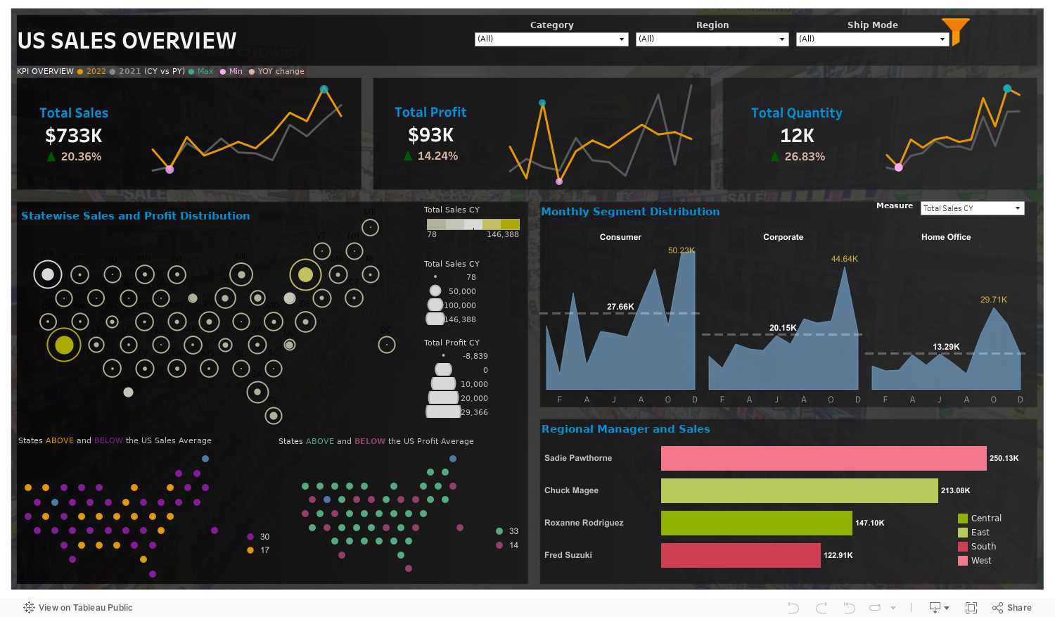
Highly interactive tableau dashboard is created with proper visualizations that captures the required KPI values which helps the analysts to make proper business decisions with just a few clicks.
The above analysis can be even filtered out further based on:
Region (East, West, Central, South)
Category (Furniture, Office Supplies, Technology)
Shipping Mode (First Class, Second Class, Standard Class, Same Day).
For example: We incurred a loss in the Furniture category and most of it occurred in October within the corporate category.
Please feel free to play with the filters in the dashboard and identify other patterns or insights.
Anyone who are reading this if you want to gain some similar skills the following resources are good to start with:
Tableau, Codebasics, Datatutorials.
Thank you for reading. Have a great day!